Different centuries, different scenarios, same map
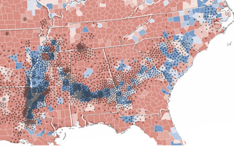
The bottom map is of 2008 county-level presidential election results. The second map—all the dots—represents cotton plantations in 1860. Quite an interesting parallel.

The bottom map is of 2008 county-level presidential election results. The second map—all the dots—represents cotton plantations in 1860. Quite an interesting parallel.